NESTFRESH EGGS
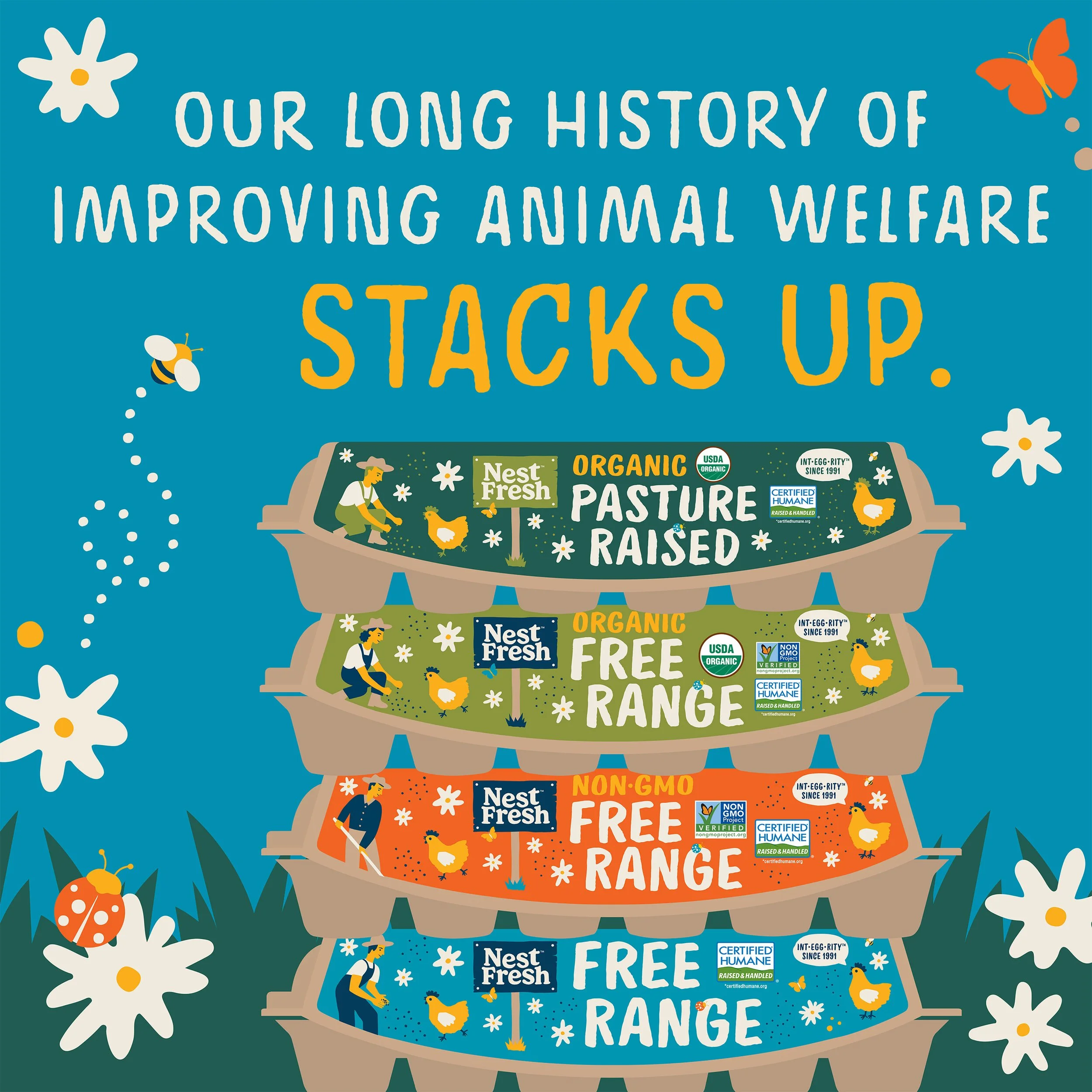
From production to retail shelf, NestFresh Eggs takes great care with their farmers and the hens they care for. With multiple production levels to account for in the product set, we knew this would need a unique solution to showcase hierarchy & the brand’s values on pack.
We partnered with the talented RvH Design to craft a set of compelling illustrations and a colorful new brand palette that makes shoppers feel the fresh air and lush grass that NestFresh’s hens get to enjoy every single day.
This pack change led to a triple-digit increase in same-store sales after it hit shelves.

LOGO LOCKUPS
We asked RvH Design to craft a few different versions of the logo: a tighter vertically stacked version as the primary, with a horizontal version for use by the corporate office and the company’s processing plants.
The lockup on the “sign” was a brilliant idea from Robert, calling to mind the signs hanging proudly from the outside gate on every NestFresh farm.

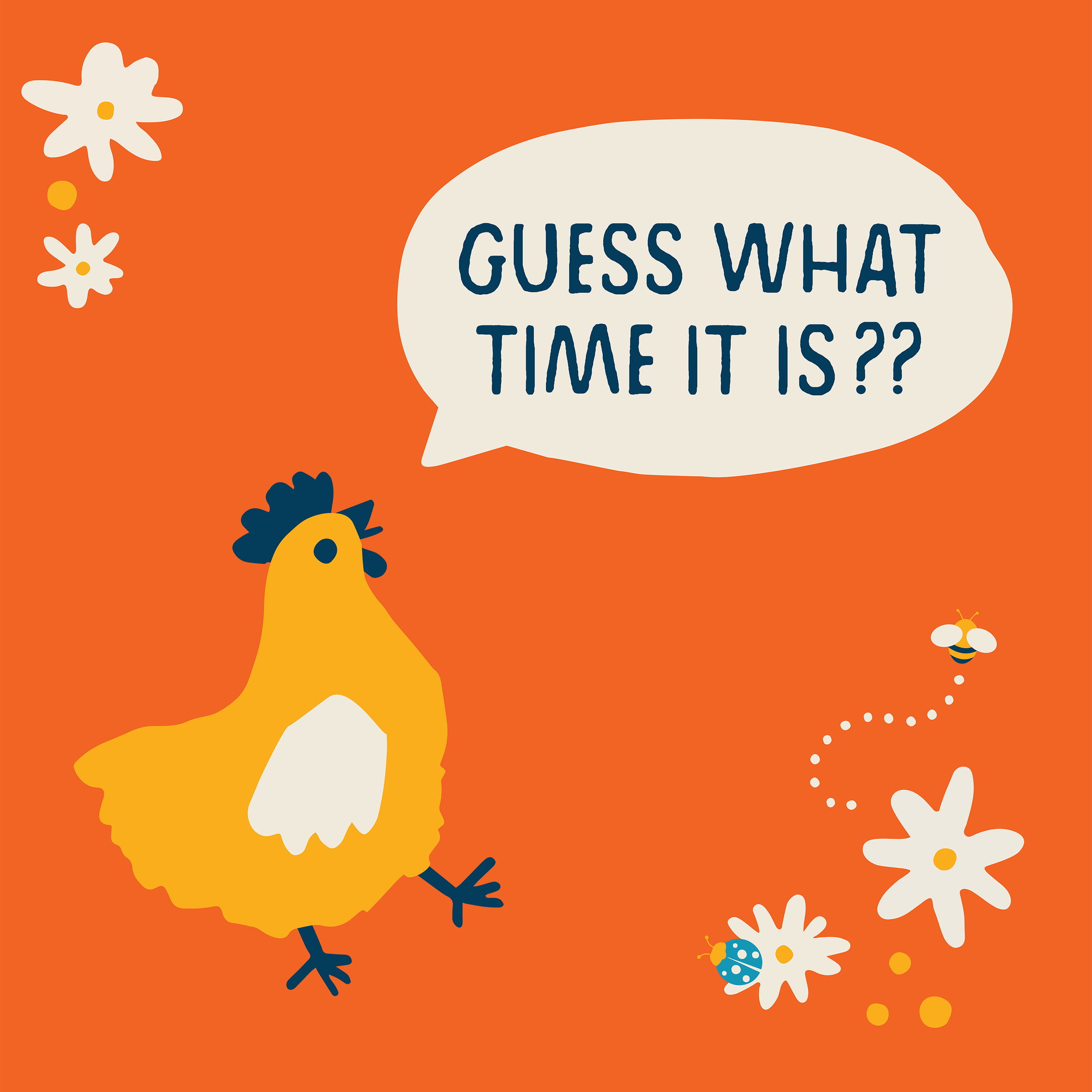
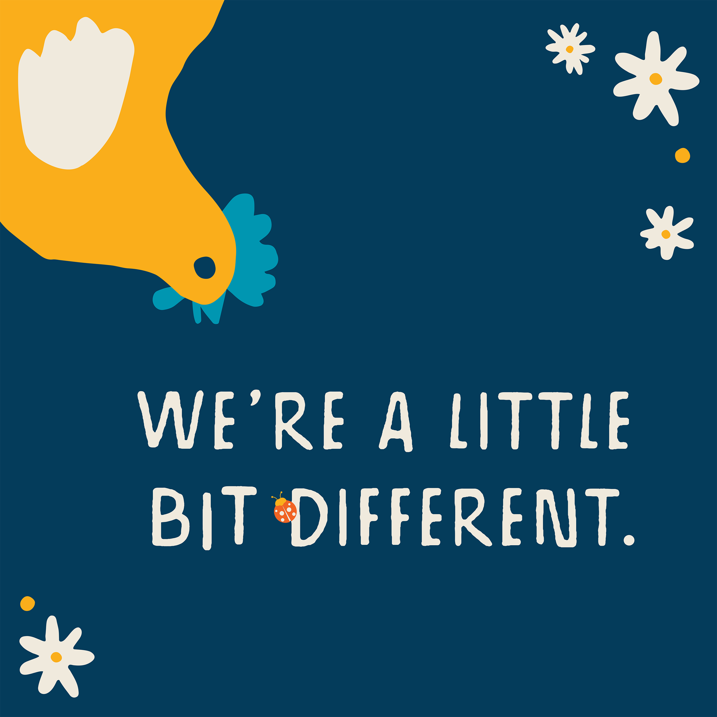
Since the brand needed a large amount of updated visuals, we saw a unique opportunity to work with the company’s leadership to craft the brand voice.
Using illustrations from RvH Designs’s identity work to create sweet & humorous vignettes, each asset communicates a key brand value while staying true to the brand voice profile we crafted for NestFresh’s new look.


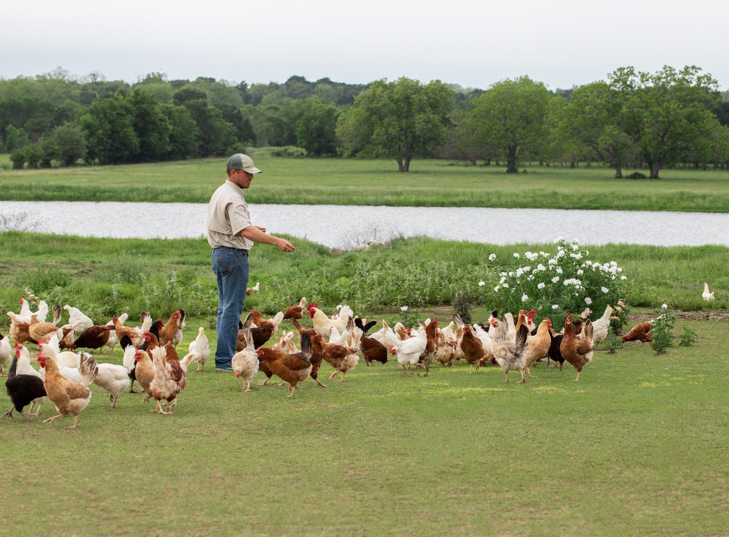
From the farms to their national network of processing plants, NestFresh supports hundreds of families across the country.
Focusing on their farmers & production team, we built a B2B messaging strategy around bringing the people involved in the process to life.